Offboarding reports are analytical documents and dashboards that track employee departure processes, providing insights into organizational effectiveness and compliance. These reports serve both operational management and strategic decision-making purposes in HR systems.
To access the offboarding reports, Navigate to the Control center > Reports > Offboarding reports
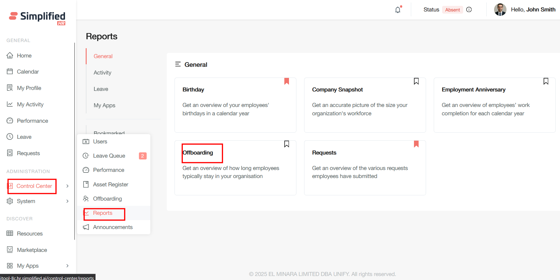
Offboarding
Get an overview of how long employees typically stay in your organisation
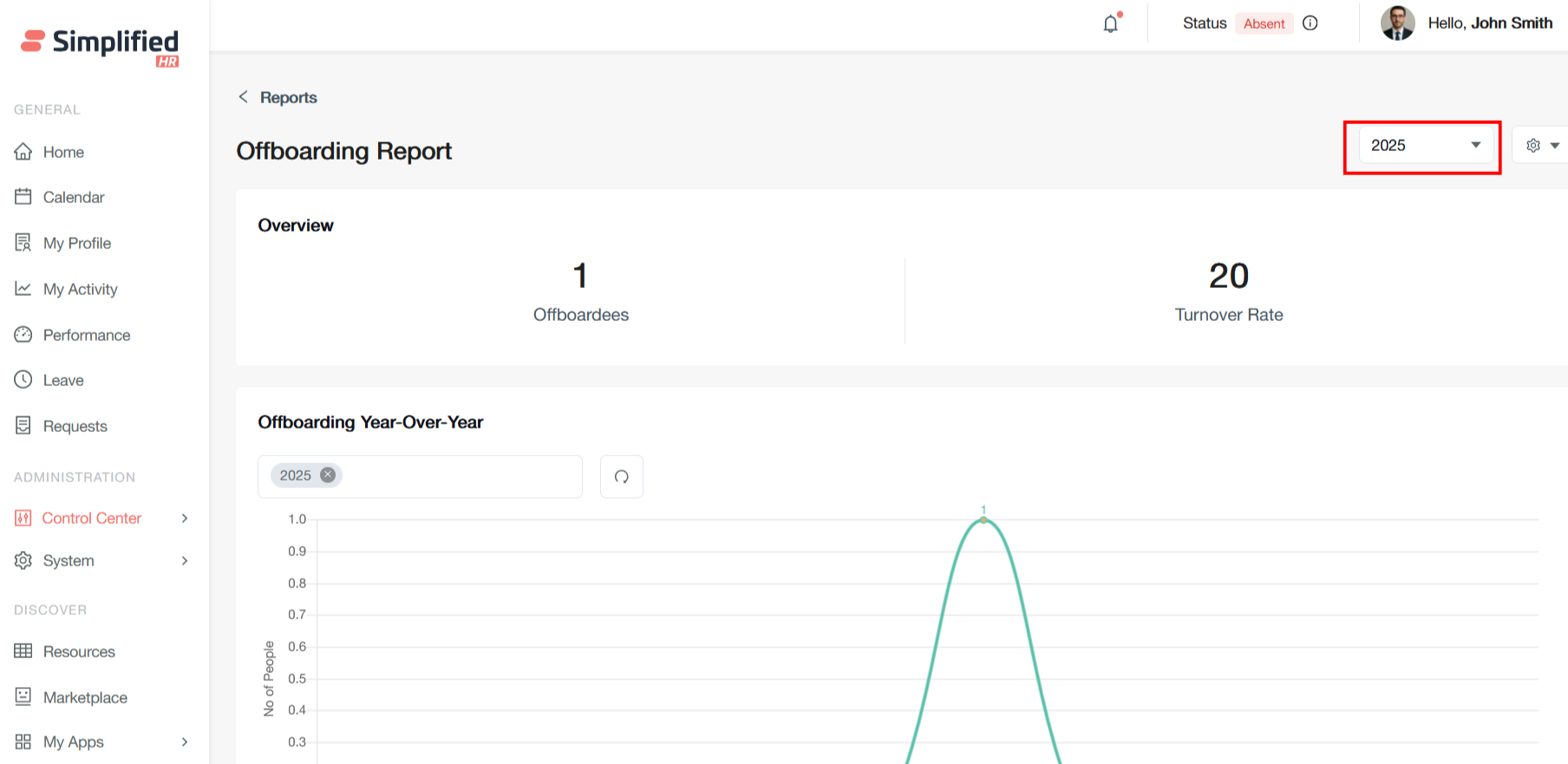
Overview Section
Offboardees
This field shows the total number of employees who have been offboarded during the selected time period (2025). In this case, only 1 employee has been offboarded throughout the year.
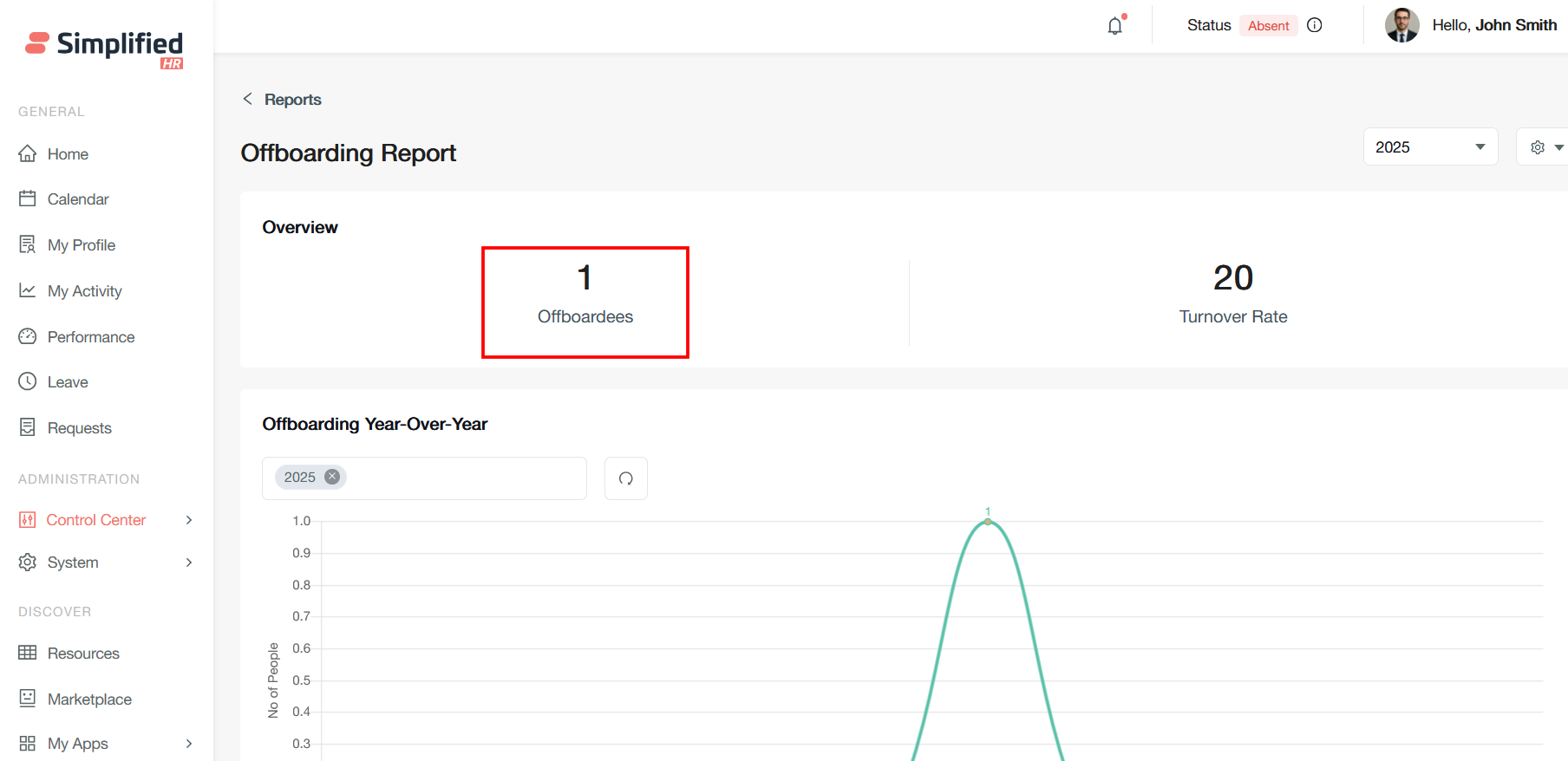
Turnover Rate
This represents the employee turnover percentage, likely calculated as (number of departures / average number of employees) × 100. A 20% turnover rate indicates that one-fifth of the workforce has left during this period.
Year Filter Dropdown
The year filter in your offboarding report is a dropdown control that allows you to select different time periods for analyzing offboarding data on a yearly basis.
The year filter (currently showing "2025") enables you to switch between different annual periods to compare offboarding trends across time.
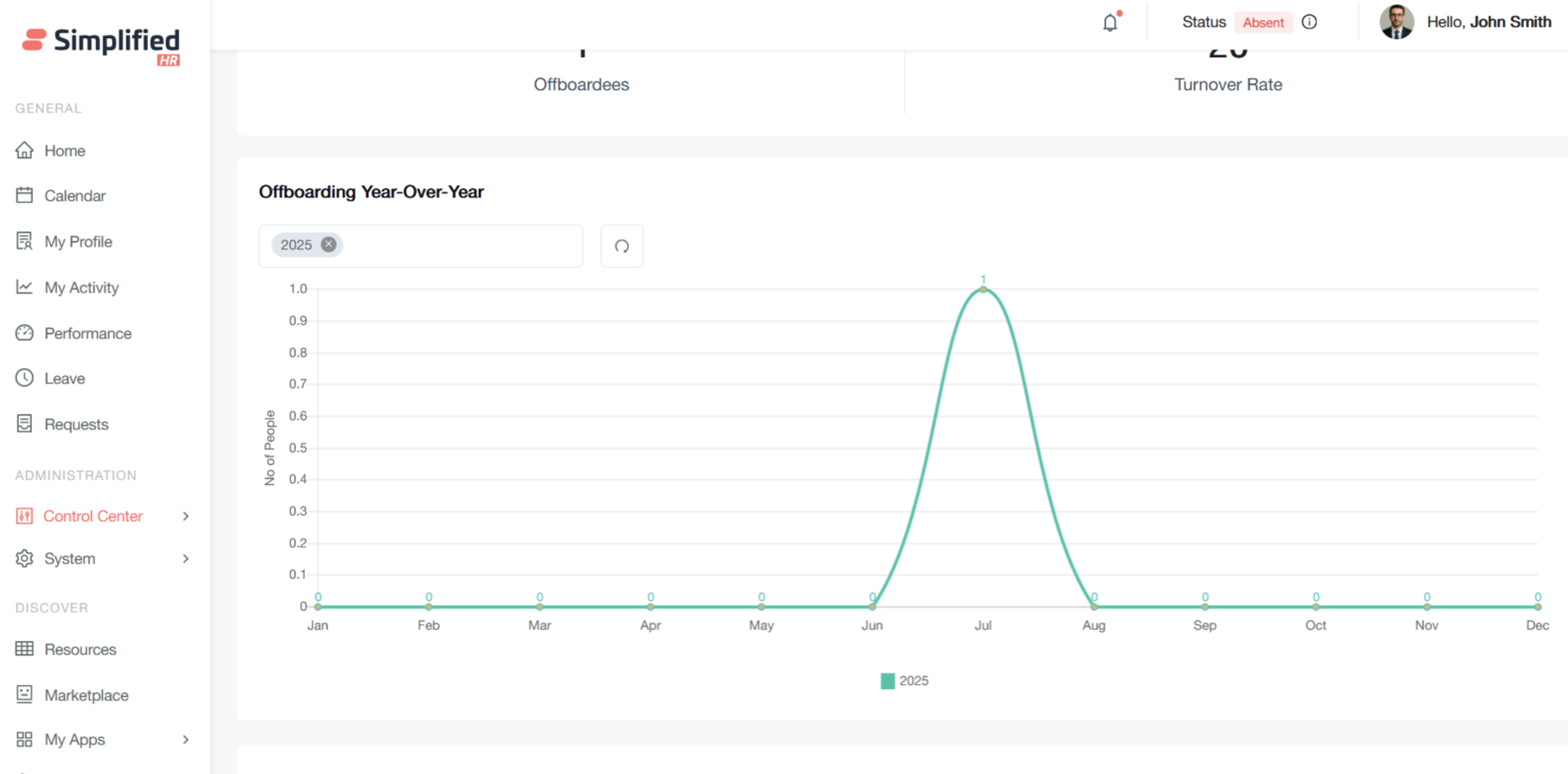
Offboarding Year-Over-Year Chart
Time Period Filter: The dropdown showing "2025" allows you to select different years for comparison and analysis.
Y-Axis (No of People): This scale ranges from 0 to 1.0, representing the number of people offboarded. The scale suggests this could be showing either actual counts or normalized values.
X-Axis (Months): Displays all 12 months from January through December, providing a monthly breakdown of offboarding activity.
Peak in July: The chart shows a significant spike reaching 1.0 in July, indicating that the single offboarding event occurred during that month. All other months show zero activity.
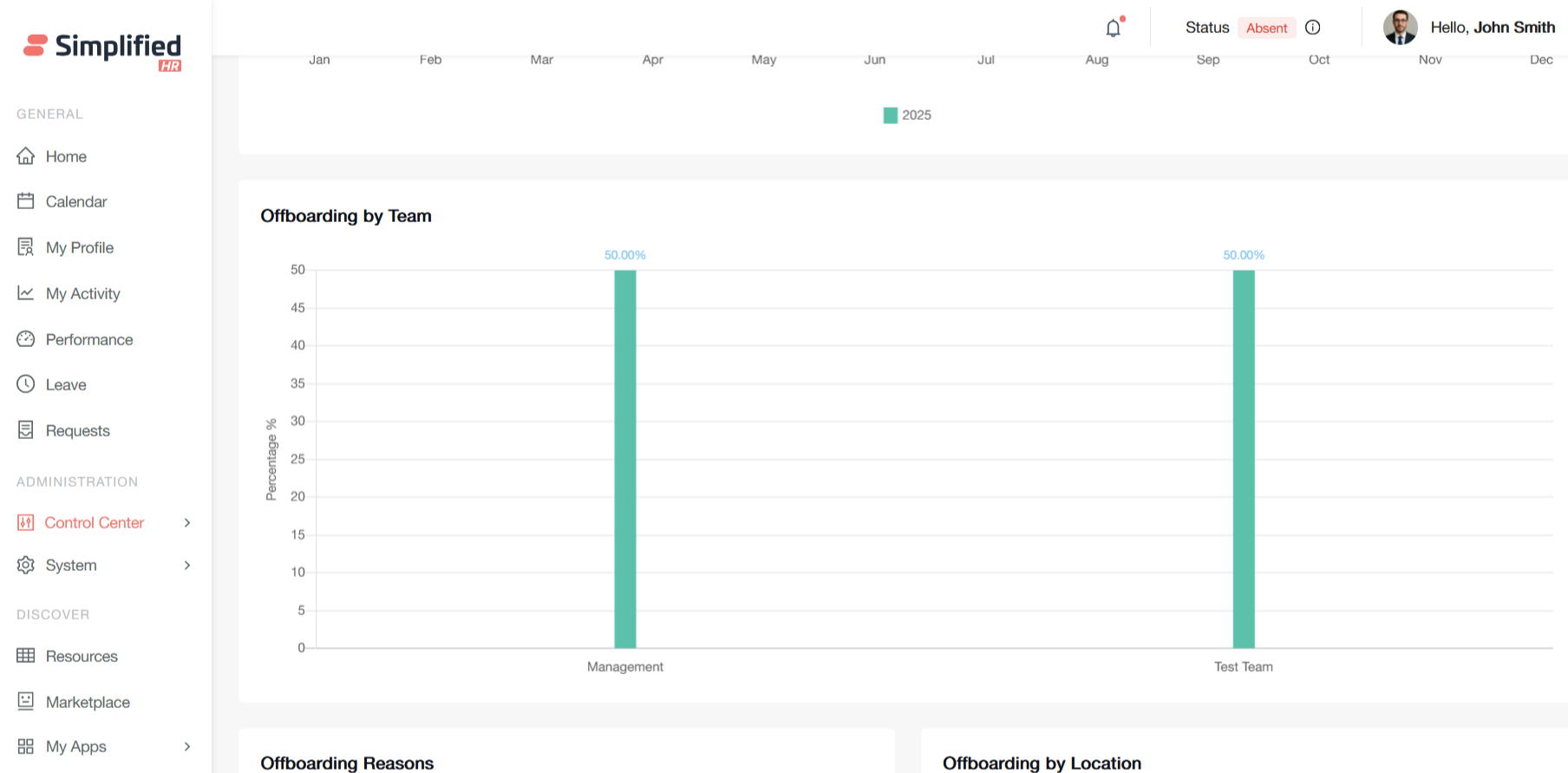
Offboarding by Team
This "Offboarding by Team" chart displays the distribution of employee departures across different organizational teams as percentages. Here's what each element represents:
Y-Axis (Percentage %): Shows the percentage contribution of each team to total offboarding, ranging from 0 to 50+ percent.
X-Axis (Teams): Lists the different teams or departments within the organization - in this case, "Management" and "Test Team."
Bar Heights: Both bars reach exactly 50%, indicating an equal split in offboarding between these two teams.
Management Team (50.00%): This team contributed half of all offboarding events during the selected time period.
Test Team (50.00%): This team also contributed the other half of all offboarding events.
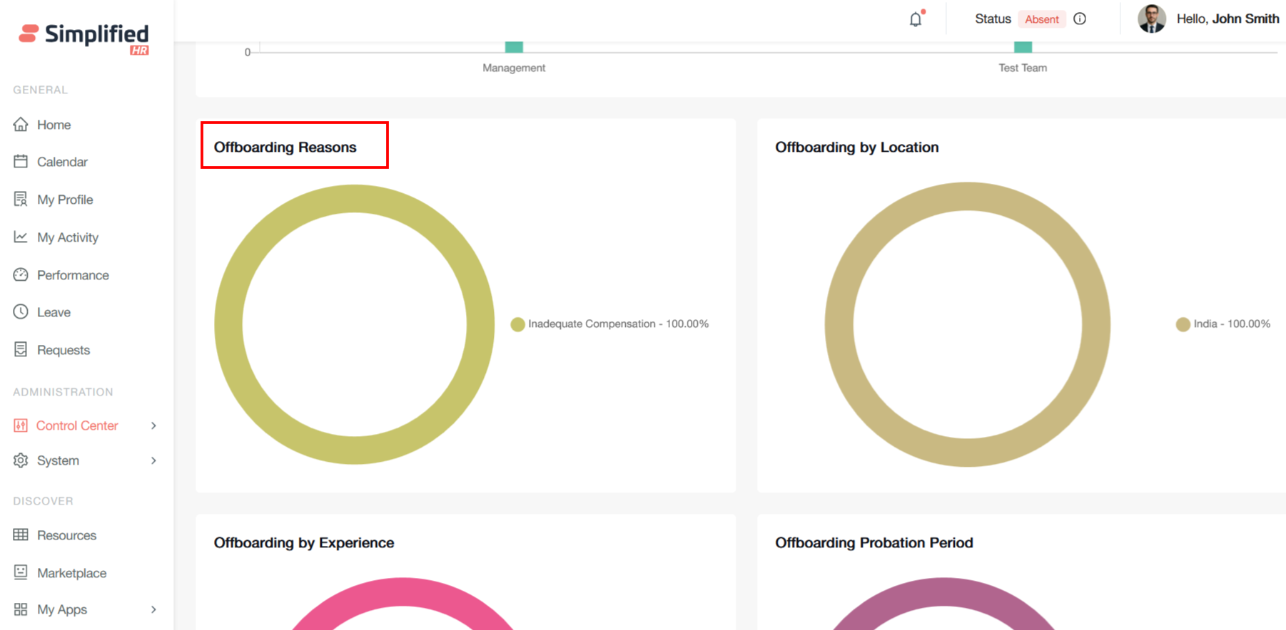
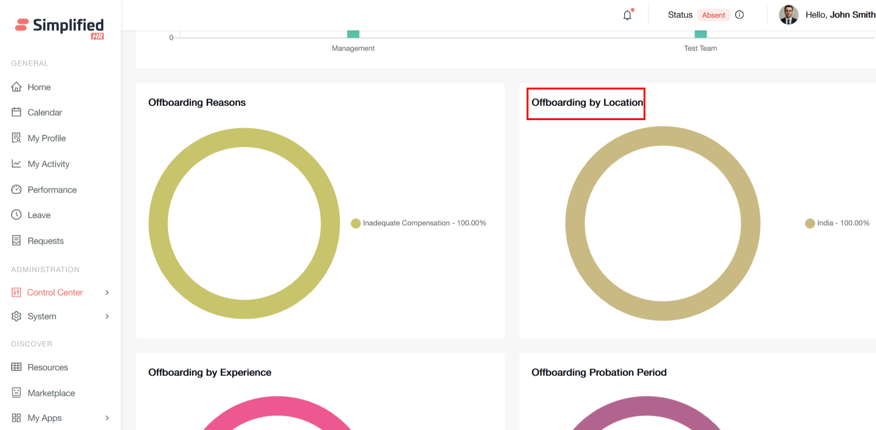
Offboarding Reasons
This pie chart displays offboarding reasons for employee departures in what appears to be data in the HR system. The visualization shows a single category.
Inadequate Compensation accounts for 100% of all recorded offboarding cases. This means that every employee departure tracked in this dataset cited insufficient pay or benefits as their reason for leaving.
This type of data visualization is valuable for identifying patterns in employee turnover and can inform retention strategies and compensation reviews.
Offboarding by Location
This pie chart displays offboarding by location, showing the geographic distribution of employee departures in the HR system.
India accounts for 100% of all recorded employee departures. This means that every offboarding case in this dataset involves employees based in or departing from India.
This geographic breakdown enhances your offboarding workflow system by providing location context for departure analytics and targeted retention efforts.
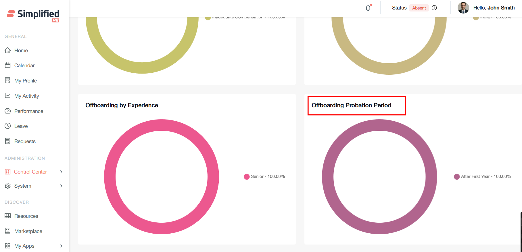
Offboarding by Experience
This pie chart displays offboarding by experience level, showing the seniority distribution of employee departures in the HR system.
Senior-level employees account for 100% of all recorded departures. This means every offboarding case in this dataset involves employees at the senior experience level.
This experience-based analysis complements your comprehensive offboarding status management system by providing crucial demographic insights for strategic HR decision-making.
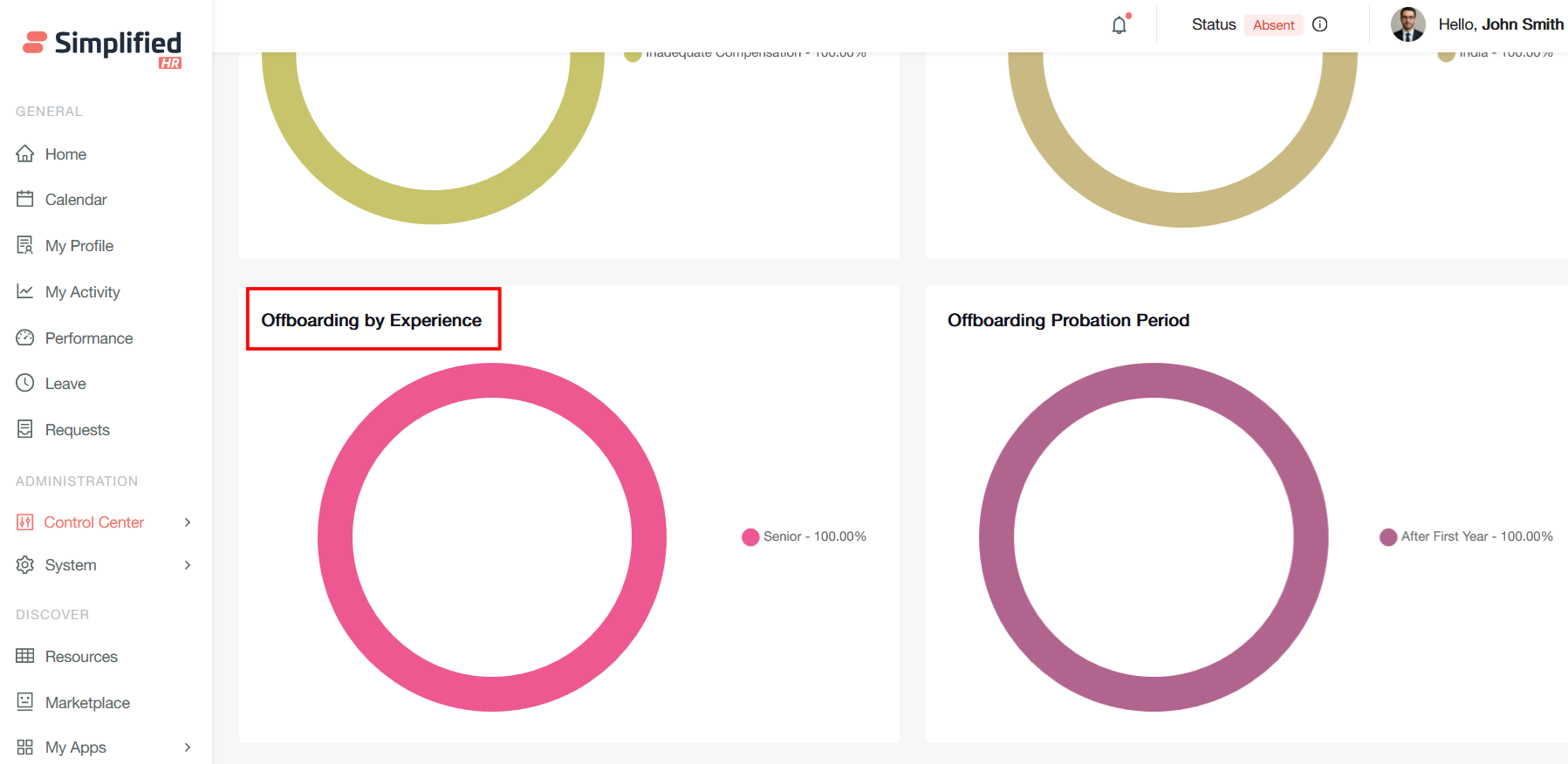
Offboarding Probation Period
This pie chart displays offboarding by probation period, showing the tenure distribution of employee departures in the HR system.
After the First Year accounts for 100% of all recorded departures. This means every offboarding case in this dataset involves employees who left after completing their first year of employment.
This probation period data completes a compelling picture of your offboarding analytics, showing how tenure timing intersects with compensation issues to drive senior talent loss in your India operations.